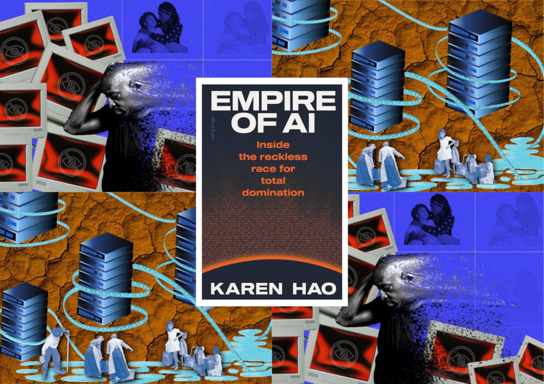
Gloria Mendoza’s images illustrate the hidden human and environmental forces which prop up the ‘Empire of AI’. After reading Karen Hao’s book, Gloria was inspired to visualise different chapters to communicate the ideas in an alternative medium. One of Gloria’s images focuses on the emotional toll faced by data workers in the Global South, inspired by a story in Chapter 2. The other image criticises the natural resources, particularly water, on which AI developments are dependent – this is also a topic discussed in depth in the book. In this blog post, we interview Gloria about her images, their inspiration, and the artistic choices made to depict technology and its impacts.
“Over the years, I’ve found only one metaphor that encapsulates the nature of what these AI power players are: empires.” – Karen Hao
How did reading Empire of AI inspire your images?
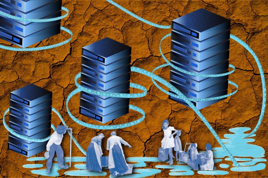
With respect to The Environmental Impact of Data Centres in Vulnerable Ecosystems, I was inspired by the book’s concise examples, something that’s hard to find when it comes to AI and automation (although see here and here). Before reading it, the environmental impacts of AI were somewhat blurry in my mind, but the book sparked my curiosity to explore how data centres are built—where they’re located, what equipment they use, how maintenance is done, and whether they can be sustainable in the long term. These questions inspired me to create this image using clear, minimal elements to illustrate the concerns I believe many people share.
Gloria Mendoza / Better Images of AI / CC BY 4.0
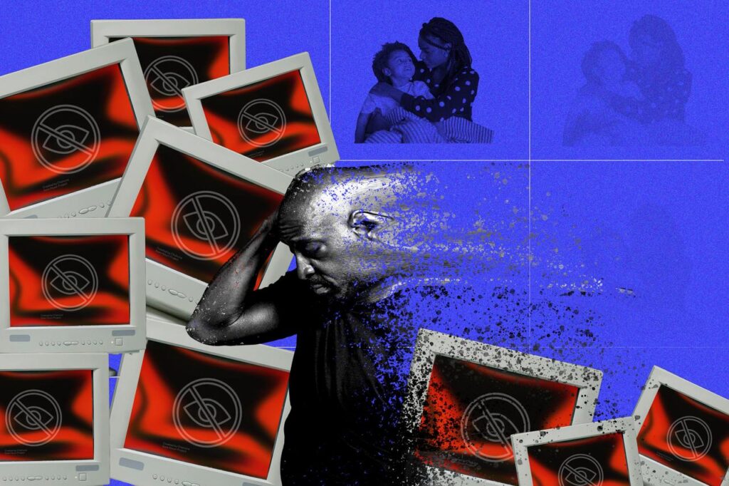
The Invisible Labour Behind Content Moderation was inspired by Chapter 2 of Hao’s book. Hao tells the story of a Kenyan man who works as a content moderator and data labeller. Through constant exposure to violent and disturbing material, his mental health gradually deteriorates. Eventually, he reaches a point where he isolates himself from both his family and his community. This story reflects the reality faced by many data workers in the Global South. Several issues emerge in Hao’s account: unethical working conditions, unlawful labour practices, and the lack of adequate protection for workers.
For this illustration, I chose to narrow my focus to one aspect of this experience, the overwhelming emotional toll that this work can take. The collage aims to convey the isolation, distress, and psychological fatigue that many data workers endure. To reinforce this narrative, I incorporated hardware and digital iconography associated with sensitive content. These elements reference the technological systems that produce and circulate harmful content, while situating the worker within the broader infrastructure that makes this labor necessary.
Gloria Mendoza / Better Images of AI / CC BY 4.0
How do you approach creating images that aim to represent AI more accurately and inclusively?
The topic of AI often feels abstract and full of jargon, which is a major challenge for illustrators in the field. It tends to distance the public from its real-world meaning and impact. Through mixed-media collages, I found a way to shed light on what a single photograph could not capture. The tension between the organic feel of hand-drawn pixel graphics representing nature and the pixel-perfect precision of technology was carefully considered. This contrast became central to the piece.
Another challenge when visualizing these dynamics was how to represent people with dignity and accuracy. I evaluated line art versus photographs, both stock and archival, and ultimately my instincts drew me toward archival imagery. Stock photos, in this context, didn’t feel connected to the real people behind the issue. It was also important to avoid harmful tropes, such as depictions of African children collecting water, since the water shortages mentioned in the book were specific to the United States. Archival photographs, with their journalistic quality, convey a sense of authenticity and create a compelling contrast when placed alongside modern technological artefacts.
While searching for reference images of Kenyans, the results were men in tribal attire, sporting hip hop style fashion, showing off jewellery, or in extremely precarious conditions. These are representations that exacerbate negative stereotypes and narratives around Kenyans and Africans at large and do not represent the majority of the population. To tackle these results, I aim to provide as much context as possible and represent communities as accurately as possible.
How do you think visual art can influence public understanding and perception of AI?
Visual storytelling can help surface these hidden realities and remind us that tech infrastructures are sustained not only by code and data, but by human labour and ecosystems – Gloria Mendoza
Visual art can help the public understand this topic because creativity and conceptual thinking are powerful tools artists use to make complex ideas accessible, legible, and thought-provoking. We are living in a decisive moment where debate and action are imperative, and art helps bridge the gap between concepts that civil society may not be fully literate in and the processes of decision-making. It is important that these ideas are understood and discussed by all of us—not just technology designers and policymakers.
Illustration can make complex tech ecosystems visible. Behind datasets, algorithms, and automated systems are workers and natural environments that sustain these infrastructures. By carefully considering representation, symbolism, and context, visual storytelling can help surface these hidden realities and remind us that tech infrastructures are sustained not only by code and data, but by human labour and ecosystems.
Could you describe the visual metaphors employed in your image(s)?
Stylistically in The Invisible Labour Behind Content Moderation, I chose distortion as the primary visual metaphor. Distortion can powerfully illustrate the damage that systemic forces inflict on individuals. It suggests the breakdown of stability; a once solid subject gradually losing control, becoming increasingly vulnerable and disoriented.
What kind of images do you envision for the future representation of AI?
I envision images that center the human experience in relation to technology; works that are explicit, relevant, and grounded in research. Representations of AI can take many tones: critical, informative, enraging, or saddening, and these are approaches artists can continue to explore while keeping their concepts rooted in figurative representation.
How has contributing to the Better Images of AI library influenced your own views on AI and its impacts?
In the end, this project became more than just an illustration; it was a way of thinking about how technology, humanity, and ecology intersect, and how images can make invisible systems visible, sparking reflection, curiosity, and awareness.
About the artist and author

Gloria Mendoza is a Colombian-American artist and designer dedicated to using visual storytelling to spark conversations around social issues and societal challenges. With a background in art direction, brand identity, and illustration, she creates research-based imagery that bridges the gap between data and public understanding. Her work invites critical thinking about equity, inclusion, and accessibility.
Cover images: Gloria Mendoza / Better Images of AI / CC BY 4.0 + book cover of Empire of AI by Karen Hao
This post is an updated version of one previously uploaded in 2025.
